Improve Your Storyboards Instantly

If you’ve studied or done animation for any length of time you’ve no doubt come across some absolutely fantastic storyboards out there. Single images that tell the story at hand with elegant brilliance yet wonderful simplicity. To create such pre-production masterpieces it takes a lot of skill and a huge amount of hard work and practice, of course, but there IS something you can do right now to make sure your storyboards really pop visually.
The secret? Add simple tone.
Hardly a secret at all, really, as contrast is the number one aspect to keep in mind when creating something. Big to small, hard to soft, fast to slow. When you add in contrast, things become much more interesting.
Take a look at the image below, from our very own Ferdinand Englander’s article “Finding Ideas: A Feature Film in an Hour.”
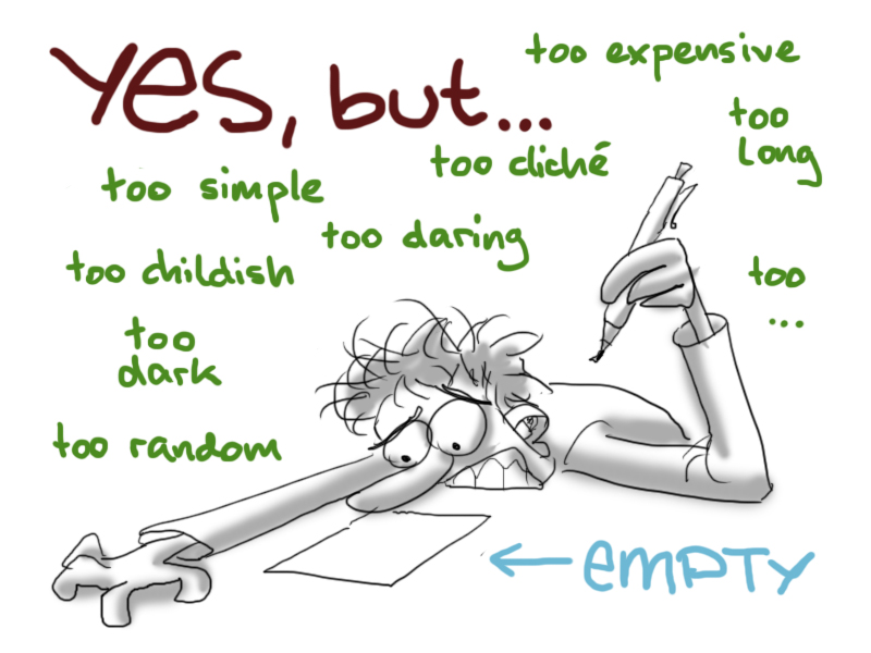
Here we see several examples of contrast, from color on the words to size of the different text to simple shadow on the character himself. Your eyes are drawn around the page to different locations because of these contrasts. Watch what happens, then, when we remove these contrasts.
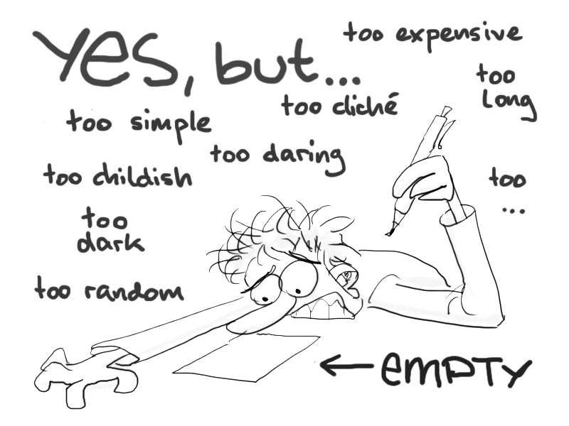
Applying Contrast and Tone Specifically to Storyboarding
Contrast is useful in all aspects of your work, but when it comes to storyboarding it shines brighter than ever. Storyboarding is all about telling a story with one image and leading the viewer’s eye to exactly what’s important. It is normally just one part of a sequence, but an essential bit that the viewer absolutely needs to see in order to fully grasp the story being told. It may linger for a split second or much longer, depending on where in the story a certain board falls.
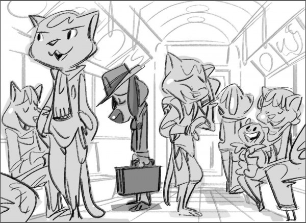
Here then contrast through simple tone can do wonders. It can transform a line drawing with a lot going on into a simple composition that everyone knows the focus of instantly. Take a look at this amazing storyboard panel by Michael Lester who works over at Dreamworks:
There’s a HUGE amount going on in this subway car, with a large cast of characters, but thanks to tone and contrast your eyes are drawn immediately to the most important aspect (the dog in the hat) and then allowed the freedom to look over all the happy riders around him. The darker tone for the dog also plays nicely into the sad pose he’s taking. (Truth be told we could study this image all day for a treasure trove of artistic goodness, but let’s get back on topic for now.)
Behold, like a magic trick, what happens when we remove the simple tonal contrast!
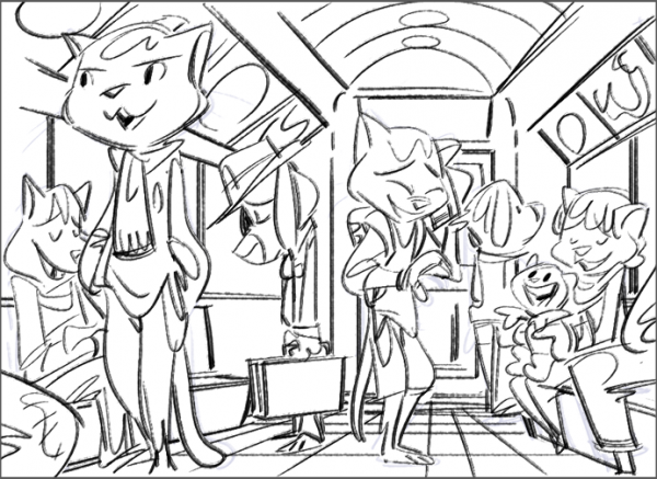
Suddenly you notice a whole lot more lines than the partially filled piece. Where exactly are you supposed to look? Is the focus the large cat to the left? Perhaps the laughing character? Maybe the story is following the child to the right, off on his first subway ride? Eventually you might make note that the dog character has a nice aura of negative space (not touching any other characters) so it may be the story is about him. Without the tone, though, getting to that point takes a lot of thinking and a long time. Time storyboard artists need to keep moving along quickly.
If you’d like to see more examples of superb use of tone and contrast in storyboards, Michael’s blog Ninjerktsu does not disappoint. It’s filled with storyboard-like-comics that are as hilarious as they are beautiful. (This one about a “Cat Lady” is one of my personal favorites.)
Keep It Simple
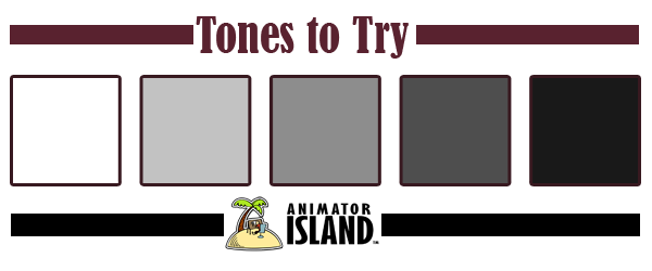
While it helps to use tone as shadow, you don’t need to know advanced lighting techniques to add this aspect to your drawings. Simple blocking of three or four tones is enough to do the trick. Things you want to draw the eye to should have the highest level of contrast, while the areas that you’d like to fade into the background should blend in with less contrast. As an exercise, try adding in these five tones to a line drawing you’ve done (or add them to another artist’s line drawings just to practice).





I’m amazed at how many young animators don’t know this already. What do they teach in these online schools these days? Apparently not the basics.
Its like you introduce 3D and all the big lessons of the past fly out the window.
Amazing stuff. Those two storyboard panels right next to each other really tell the story. Its so obvious that the dog is the important part in the first but then you look at the other one and it’s like a totally different world! I’m going to try this out some. I usually just do my thumbnails in line not filled up. Thanks.
Epic stuff by a great storyboard artist you got there. 😉
Nice read, I just passed this onto a friend who was doing some storyboards for the first time. That class is brutal!
I find the caricature rather fascinating! your such an artist! Thumbs up!!!
That is my new inspiration, that dog is amazing.
Nice post! This separation of the interest areas in the compositions are fundamental!
And the story board of the Cat Lady is really amazing!
Great stuff I’ll try this now.
That difference between the two storyboards is remarkable. I never would’ve guessed it would be that dramatic. Touche.
That’s amazing. The difference between those two! I had no idea! I’m going to add this on my storyboards. Right now they’re all so flat!
it is amazing that u described about storyboarding. i’ll practice with tones to my previous s.boards to feel the difference.
Oh my goodness! an impressive write-up dude. Thank you
Hello! I just would like to give an enormous thumbs up for the very good info you’ve here on this post. I will likely be coming back to your site for more soon.
Fantastic!
This has to be one particular of my favored posts! And on best of thats its also incredibly useful topic for newbies. thank a lot for the information!
Sweet site, super design, very clean and pleasant.
It broadens the horizons.
Great article! My storyboard/thumbnails are always so basic. This should help for more complex/populated scenes.
Pardon me, does anyone know about how you become a storyboard artist in a major studio? It is the job I would want to take.
Very Nice